

Woman Averts Eyes
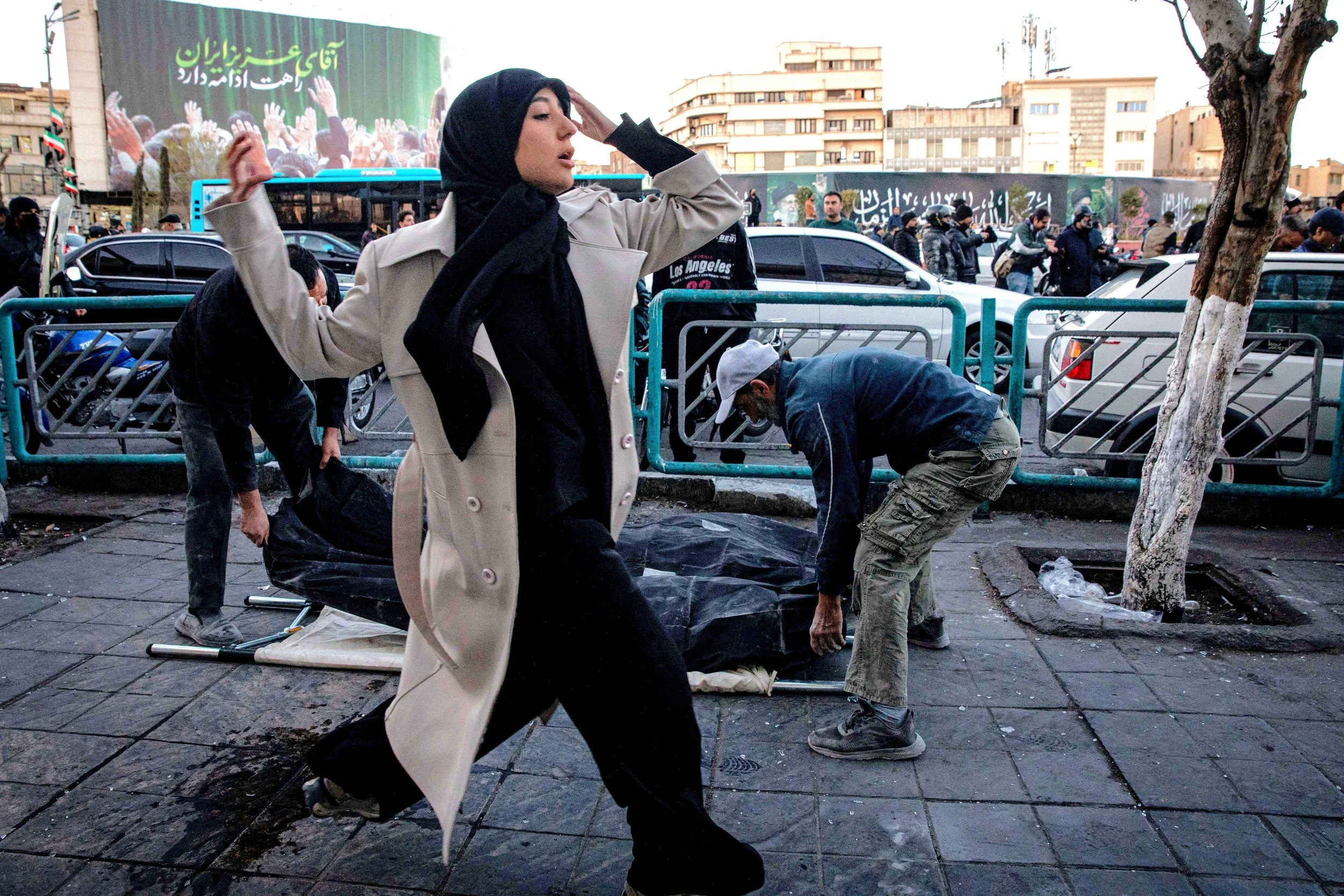
A study of a photograph taken by Reuters, titled:
A woman runs past people retrieving casualties following strike on a police station in Tehran, Iran, March 3, 2026 - Majid Khahi
A woman in Tehran averts her eyes as she rushes past people who are collecting the dead.
Study: Oil (11×14 hardboard panel)
Although a high resolution image the exposure and lighting lacks detail suitable for a portrait. Increasing the exposure highlighted contours in the headscarf but shadows in facial features were grainy and bleak. I tried to envision the scene as Tamara de Lempicka might have. I applied lessons learned from the Young Ladies study to the headscarf but fully committing to the Art Deco style left me short of imagination. I feel I had some success in highlighting the beauty of the subject without diminishing the somberness of the moment.
Headscarf:
Ultramarine Blue
Alizarin Crimson
Titanium White
Paint applied and mixed on panel. Blue+Crimson excellent dark shadow.
After a road trip, approx. 10 days, Safflower Oil applied to dark and light areas leaving midtones muted.
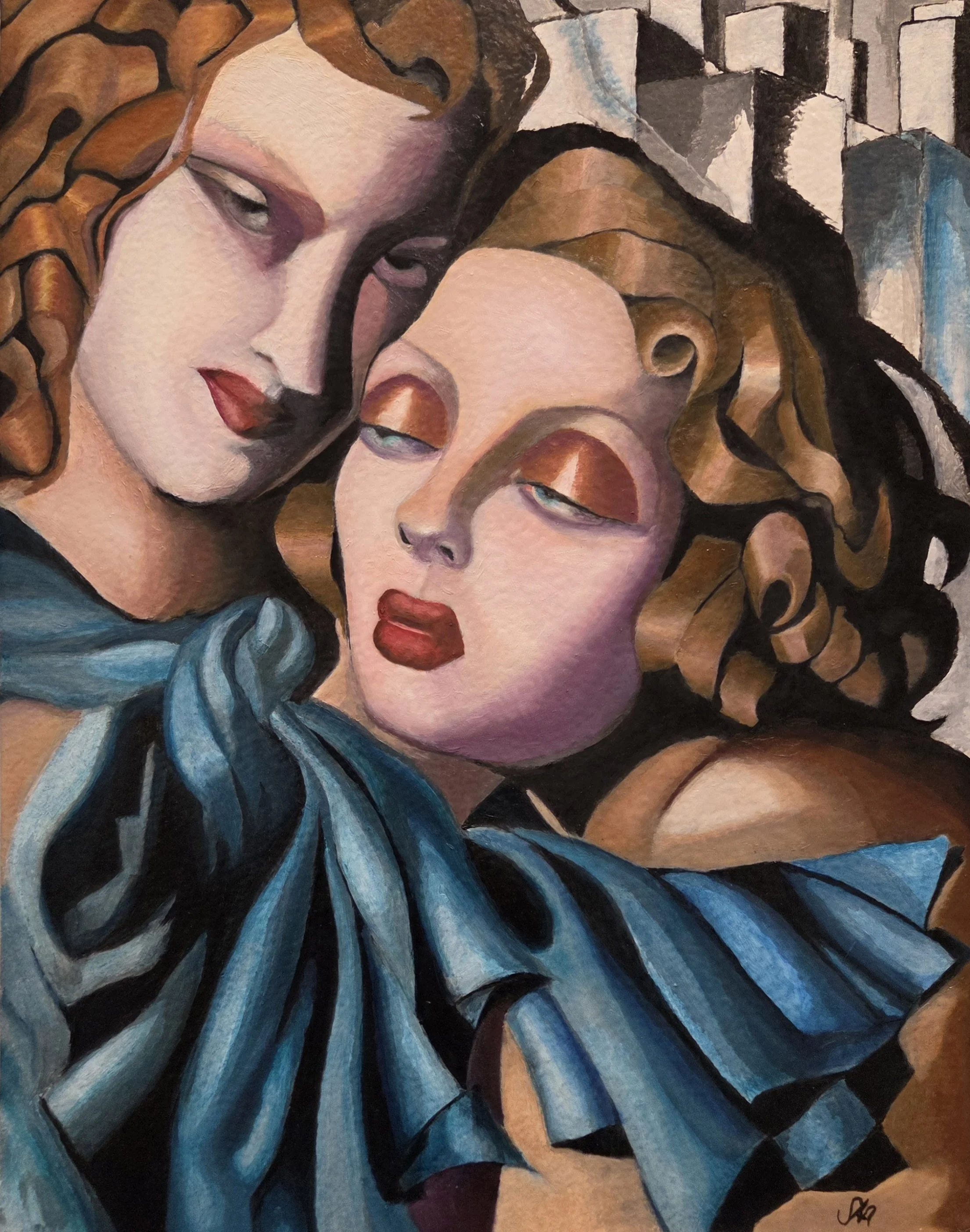
Young Ladies
When viewing the painting it is very satisfying how the eye interprets the hair. Up close it is a collection of interesting shapes consciously perceived as hair yet fifteen feet away it flaunts a luxurious reality seemingly without conscious effort.
I love Tamara de Lempicka’s bold, unapologetic compositions that seem to pop out of the canvas in vivid colour. At first glance her Art Deco style appears to simplify reality with its clean lines, deep contrast and sculpted forms. A closer look deepens the experience as the eye is guided by dramatic shadows toward a brilliance of hue and impacting detail that give way to something larger than life.
For more information about the original artist see: https://tamaradelempicka.org/
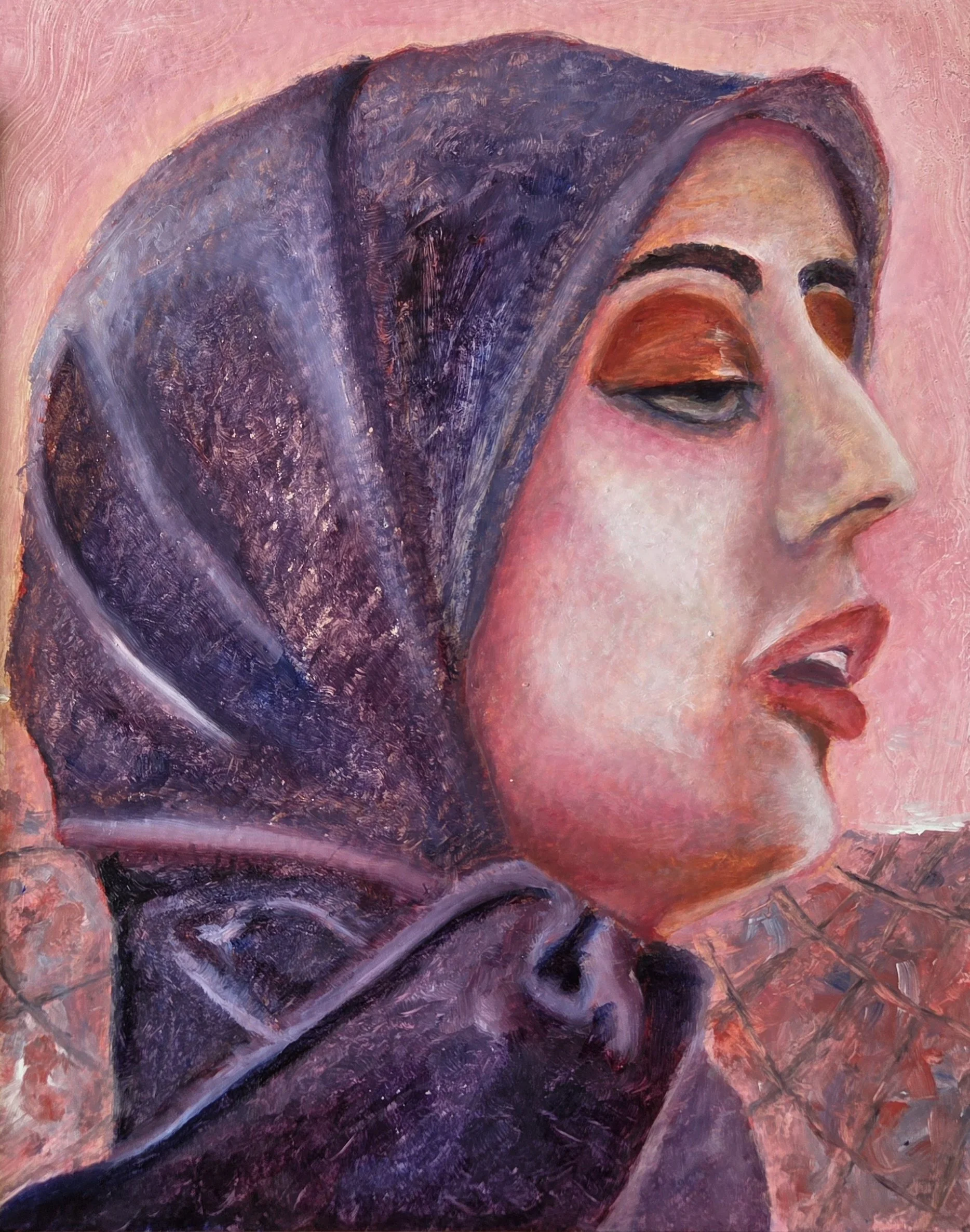
My two oil studies are Lady with Gloves followed by Young Ladies

Lady with Gloves
Lady with Gloves
I soon got into trouble as too much thought and procrastination lead to impatience by the time I finally began to paint. Compounding this was the unforeseen upshift in discipline needed for the task. I had just completed a Renoir master study of the portrait of Jeanne Samary. With its loose brushstrokes and forgiving boundaries it was a joy to paint. With this study I struggled to garner the discipline and process needed for a much tighter precision.
Struggle with shadow began by poor planning as the face and neckline underpainting were painted at different times. I wanted the shadow around the neck to be warmer and transition cooler toward the forehead. But the underpaintings differed so much that I couldn’t achieve the right mixes of glaze to compensate for good harmony. In the end, I started anew by repainting the areas an opaque grey and took the penalty of waiting several days for it to dry.
The blonde hair is too yellow. At the top hairline I tried to match the reference shapes as best I could but lost focus as I neared the bottom half of the hairline. This too was repainted twice with a black mix (Ultramarine Blue + Burnt Umber).
The green dress base colour is Phthalo green with blue, yellow and white highlights. As I painted I became intrigued with the cubist patterns ornamenting the left shoulder of the subject’s dress. I enjoyed the freedom of pulling the hues of wet on wet paint giving depth to forms and carving to create or reinforce boundaries. This work influenced my repainting of the bottom hairline. This difference in style between the top and bottom hairline stings my eye whenever I look at the painting.
Finally, the curtain and shadow were glazed with a Dioxazine Purple and Alizarin Permanent for a harmonizing violet hue.
Young Ladies
Determined to be more disciplined with my next study, I began with a grisaille underpainting. This shifted my focus on shape and (grey) value to greatly simplify the layout of the composition. I used the Di Vinci Eye App set to break down values into five discreet steps as a guide. I manually transposed an 8×10 picture of the reference painting to a 16×20 prepared hardboard surface by transferring about 20 coordinate measurements. I began by painting a general outline in a light grey using the transferred coordinates as a guide.
Palette
For Ginger hair the basic colour was a mix of Burnt Sienna heavily tinted with Titanium White. Tone with a touch of Earth Red (Transparent Oxide Red) or brighten with a touch of Cadmium Red Light or Napthol Red. I sparingly brushed a light yellow or white wet on wet to brighten further.
For Blonde hair I used a subset of Ben Lustenhouwer’s palette: Ultramarine Blue, Alizarin Permanent, Earth Red, Cadmium Red Medium (a substitute for Deep), Raw Sienna, Yellow Ochre, Titanium White. Mauve was mixed with: Ultramine Blue + Alizarin (a Crimson) + White. Mauve was particularly useful as a compliment to knock down too yellow a colour.
For the Skin I wanted to use a minimalist “Zorn” (Anders Leonard Zorn) palette but the complexity of colour around the eyes and shadow made me shy away from the idea. I added Dioxazine Purple as a glaze to deepen colour of shadow around the eyes and nose.
The Dress flutes were a mix of Phthalo Green and Blue - transparent out of the tube and with a dab of the brush in Safflower oil made for a glass like glossy glaze. The (grey) values in the underpainting came through depending on the thickness and mix ratio of paint and medium. In the lightest areas I wiped off the glaze to allow the brightest underpaint values to show through.
Painting
Young Ladies by Viktor Kiss
I began by glazing the dress. The glossy brilliant hue of the blue green was intoxicating forcing restraint to keep some areas muted with the thinnest of glaze.
Encouraged, I began painting the hair. Taking many approaches: mostly wet on wet where I would first paint bands of colour and with a long haired or filbert brush gently blend and pull the hues to suit. As I worked I would inevitably brush out of bounds prompting a chime in my head. “Know when you are adding or removing paint”, said Florent Farges on one of his Youtube videos. An obvious fact I needed to hear. Continuing on I would finish the area I was working on then wipe the brush a half dozen times to “clean” it and begin the cleanup. I removed unwanted paint wiping the brush and repeating as needed. The cleaned area generally needed a reapplication of its colour. Tighter precision meant fewer repeat cycles of this cleanup dance.
When viewing the painting it is very satisfying how the eye interprets the hair. Up close it is a collection of interesting shapes consciously perceived as hair yet fifteen feet away it flaunts a luxurious reality seemingly without conscious effort.
A note on brushes
I used a synthetic (Taklon) flat brush of about ¼ inch as my workhorse. I use the tip on either side to apply detail and the flat edge to apply and carve paint. I’m becoming accustomed to using a half dozen brushes for most paint sessions: A 0 or 1 round for detail, large flat brush, long haired brush for blending, a filbert for flattening and blending (especially from awkward angles), at times a hog hair to remove semi-dry paint.
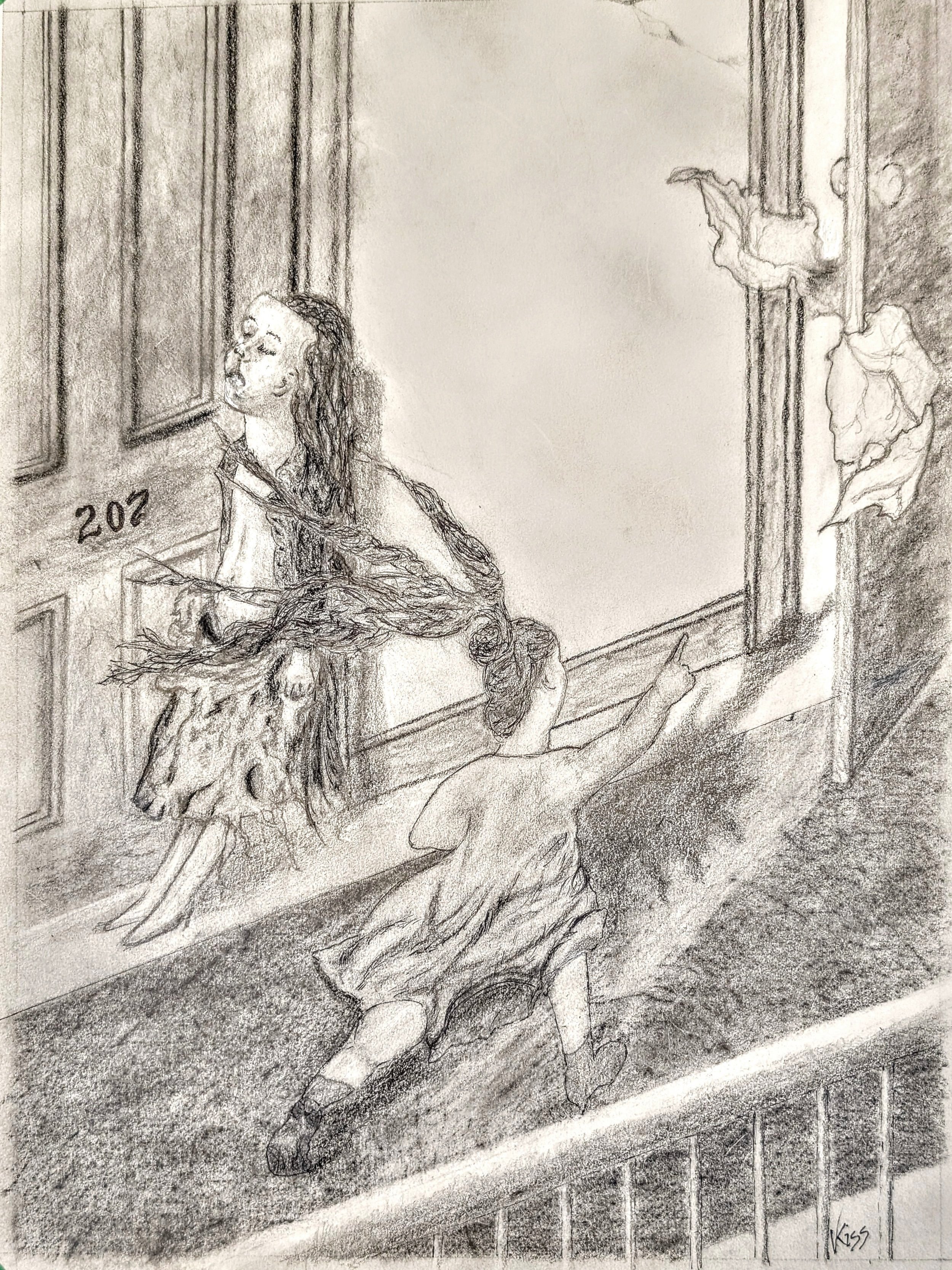
Ecstasy of Saint Teresa
My introduction to Tamara de Lempicka began with a pencil and ink drawing that I called “Avila”. At the time I had kidded myself into thinking that I had somehow projected a greater sense of realism from Tamara’s Art Deco painting.
Avila by Viktor Kiss

Sainte Thérèse d’Avila by Tamara de Lempicka
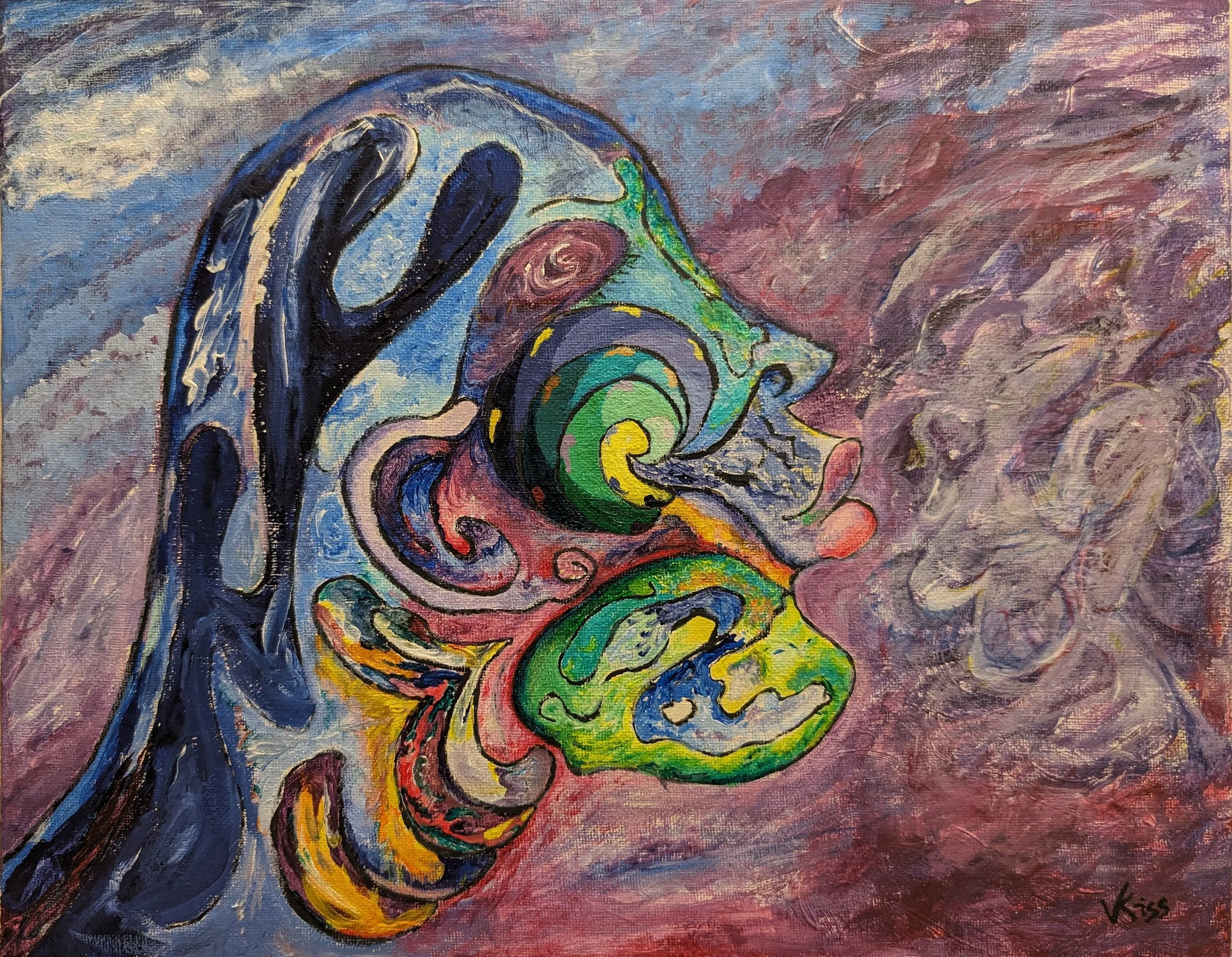
Psychological Entropy
Psychological Entropy
One ordered state has many more disordered possibilities - so, order has special meaning. In life as in art order shapes our understanding. A line may preserve order by bounding a dark colour to protect a lighter hue. A seismic shift in thinking, yet subtle to the eye brings change to the order as it now serves to protect the dark and bound the light. Left unchecked the dark will dictate into blackness. Unless of course, a bright spec of light brings a new order to the world.
Concept:
Inspired by a profile photo of Zoe Saldaña winning and kissing her Oscar.
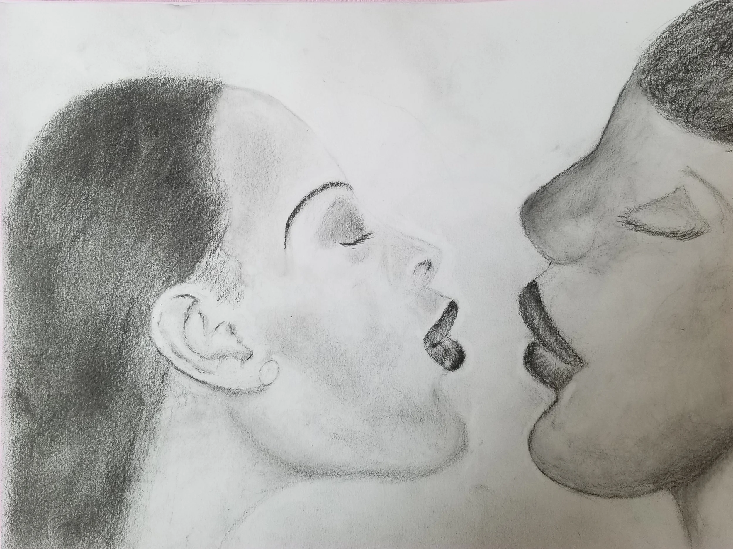
Dreamscape drawing of Zoe Saldaña
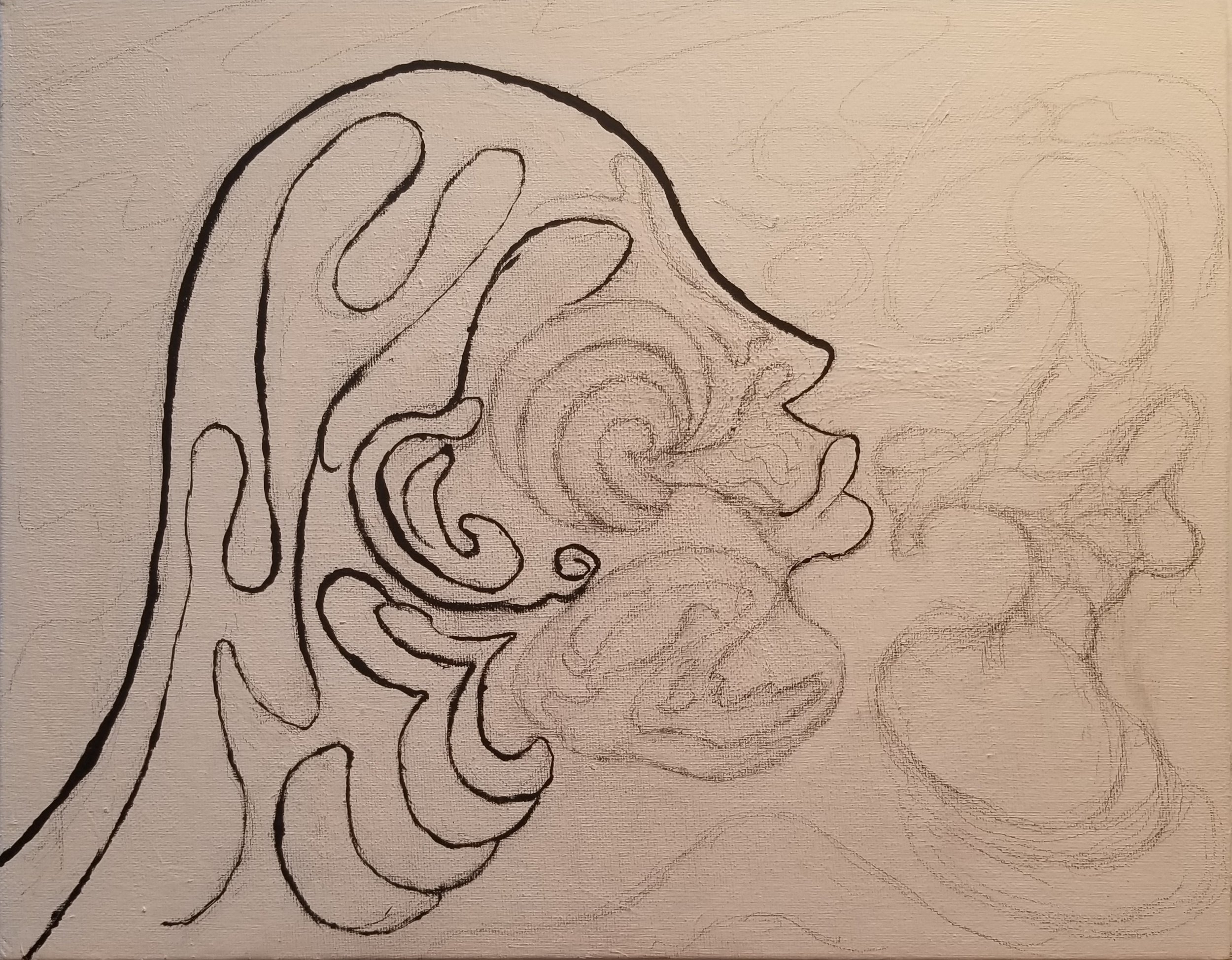
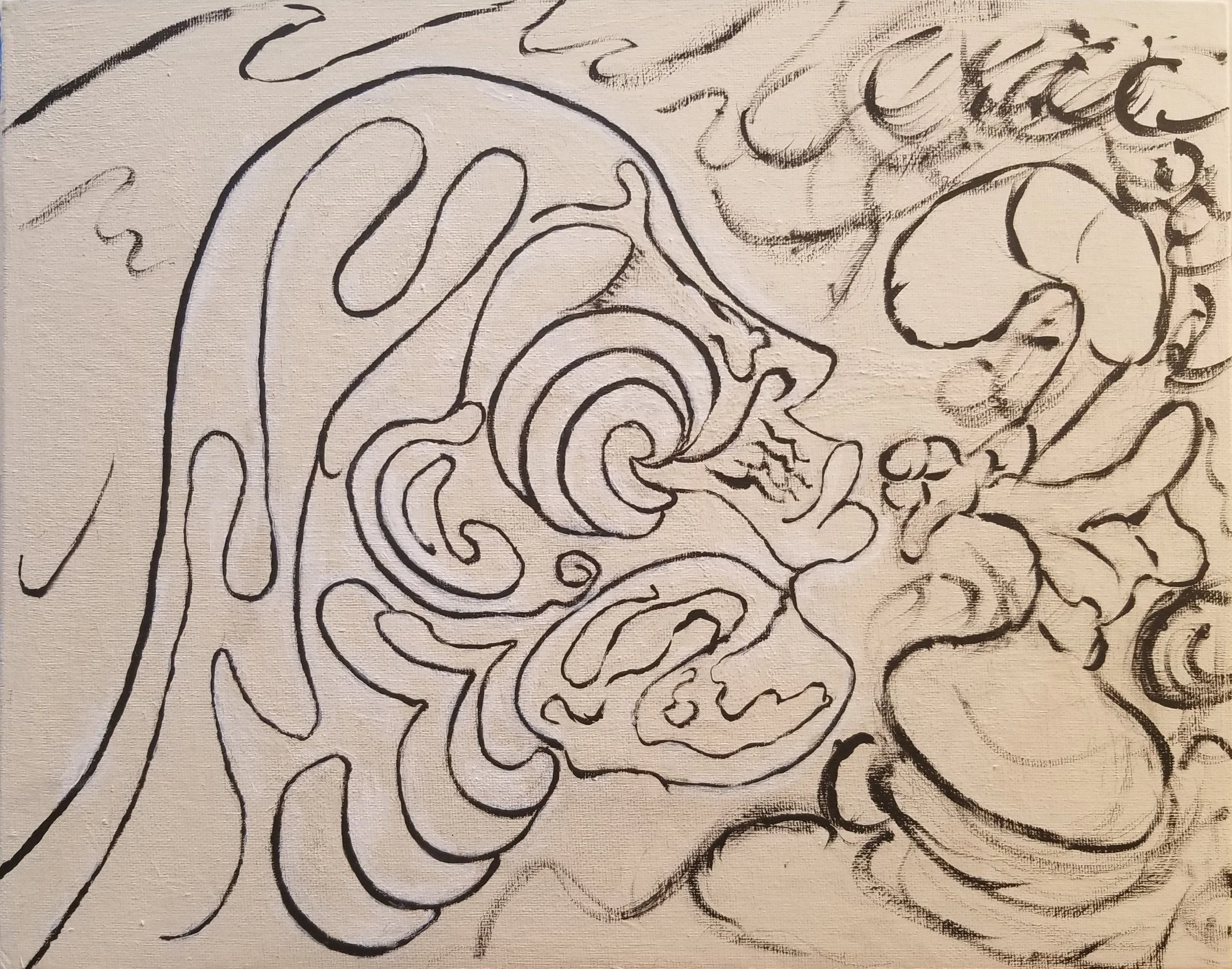
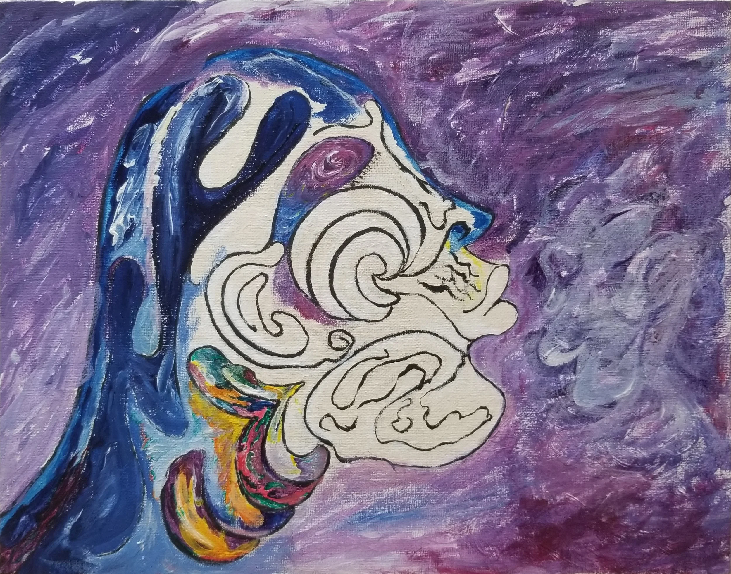
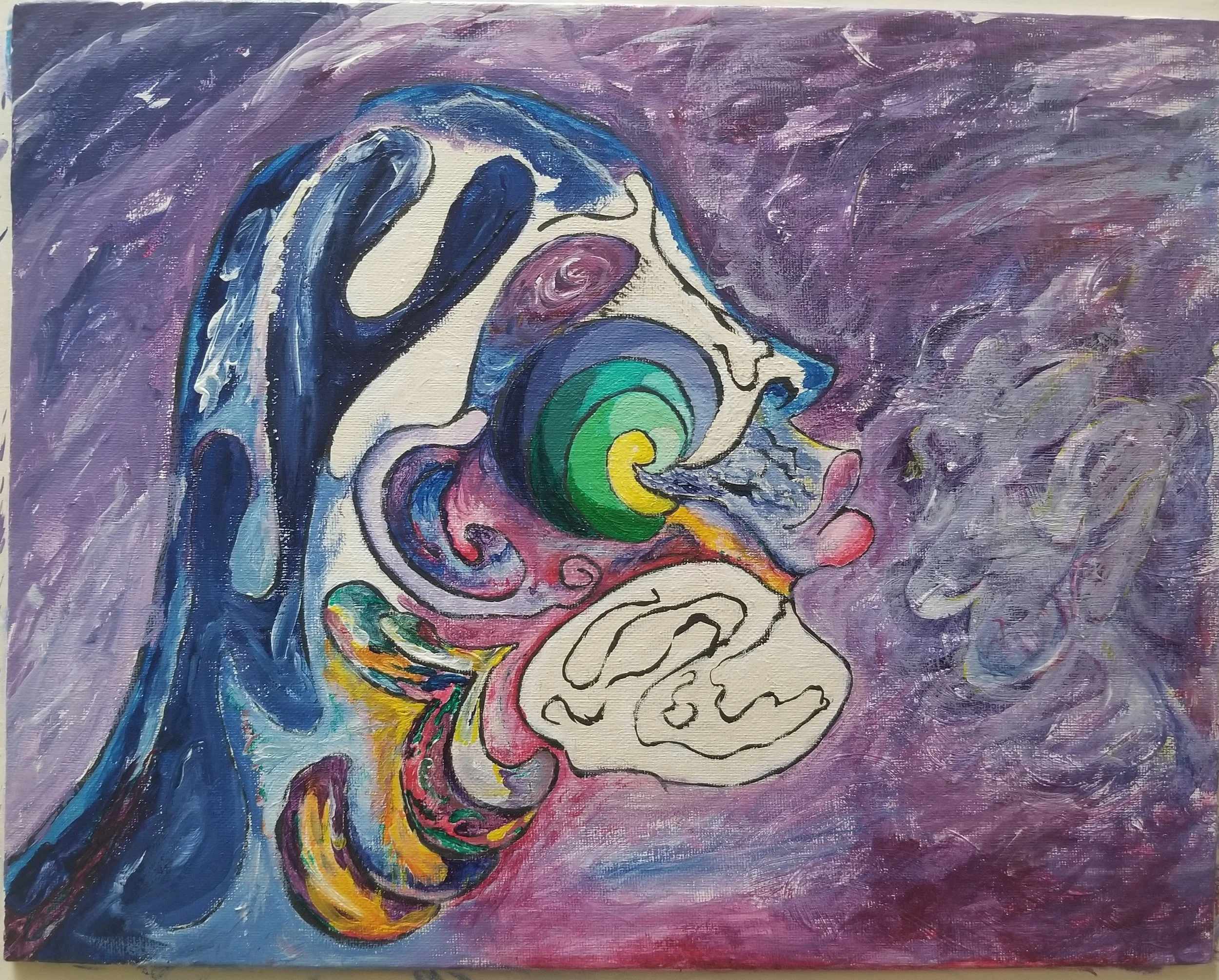
I had many goals for this study. Learning affect of analogous and complementary colours. The use of arcs and circular patterns to define area. I did want the head to be less defined and hidden within the painting. The snail and hints of other evolutionary artifacts is intentional, the snail shell intended to add depth in the cheek. From left to right calm turns into a chaotic storm solely due to human influence.
Acrylic on 11 x 14 canvas panel, colours:
Titanium and Zinc White, Mars Black, Phthalo Blue (Red Shade), Phthalo Green (Blue Shade), Quinacridone Red, Benzimidazolone Yellow Medium & Light.
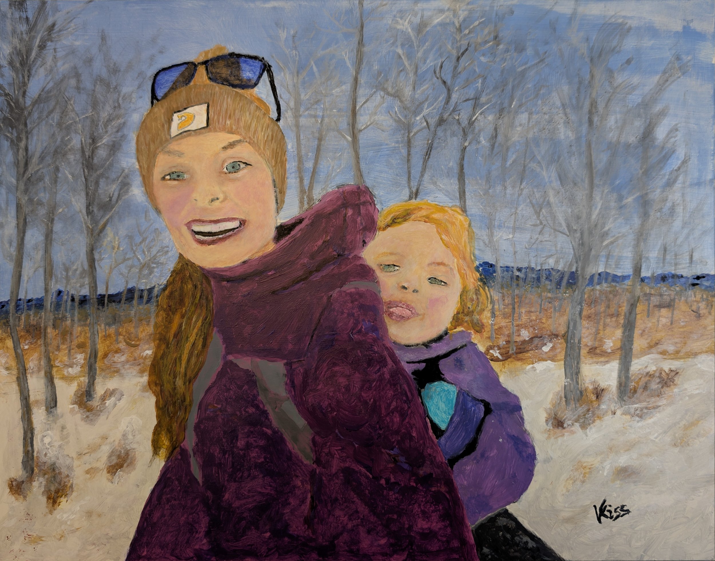
Christmas Cheer
Mom and daughter enjoying the trail on Christmas Eve 2024.
Christmas Cheer 2024
Mom and her daughter enjoying the trail on Christmas Eve. The joyful moments captured on video of my granddaughter and her mom on the Bragg Creek trail in Calgary inspired this painting.
Colours:
Mom’s coat: Dioxazine purple + Quinacridone red + Titanium White; Light tone followed by deeper purple
Daughter’s coat: D. purple + T. White, Teal mitt
Sky: Cerulean and Ultramarine Blue + T. White GlazeR
Skin tones: Raw & Burnt Sienna, Aliaarin Crimson Hue, Qunacridone Nickel Azo Gold (QNAG)
Hair: Yellow Ochre, Raw Umber, QNAG, Cadmium Yellow M., T. White
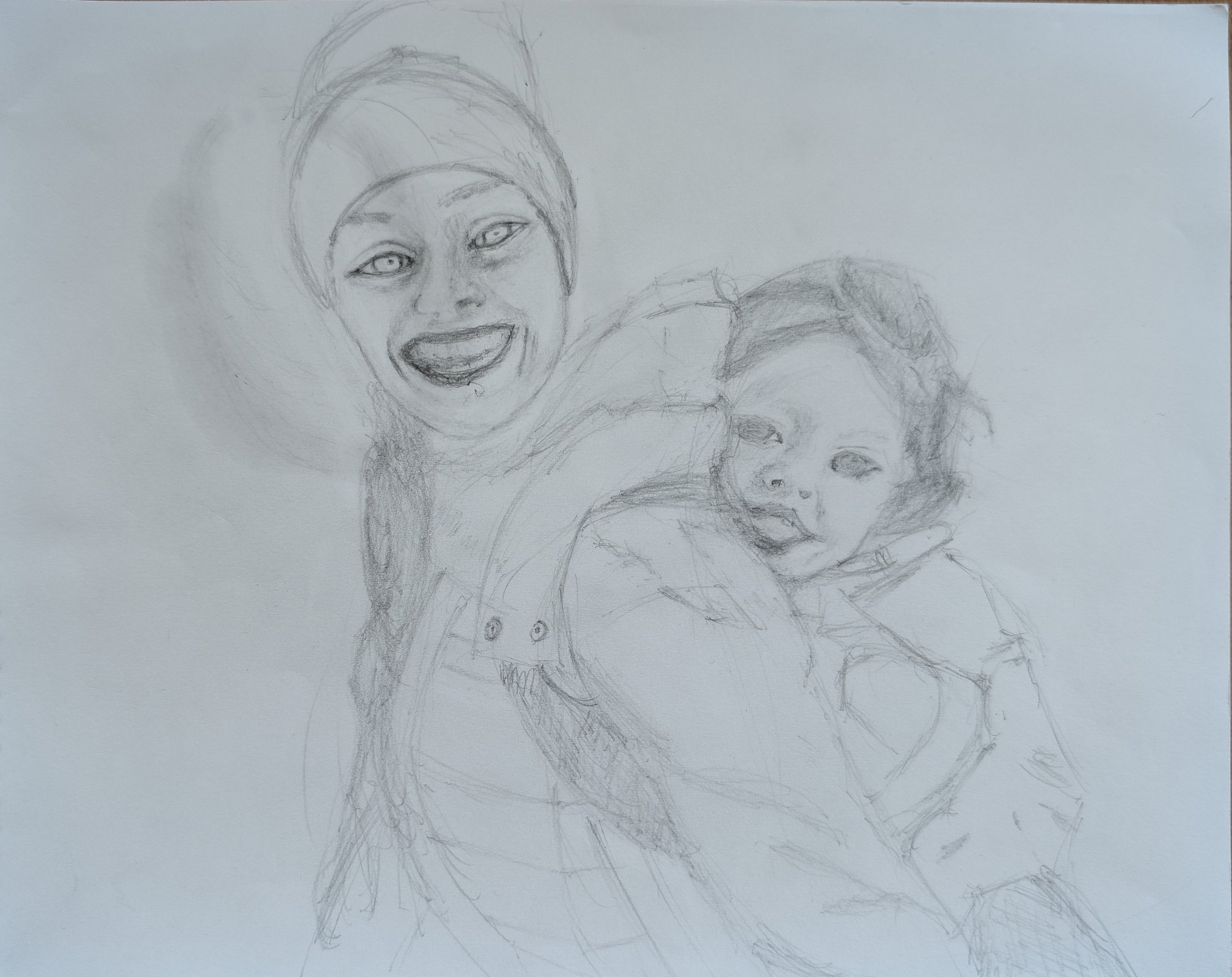
Sketch:
Notes:
Purchased Da Vinci Eye app midway through this project. Found it useful as an aid for developing perspective and value breakdown. It is a modern AR Camera Lucida. The subject picture is superimposed with the camera focused on the canvas. In theory, the image can be copied by tracing the image viewed on the cellphone screen. An opacity control and strobe provide for different ways of visualizing and comparing progress. Very useful was the ability to expand the image which also zooms into the canvas, thus allowing fine detail work without the need of a magnifying glass.
Setup was finicky and I found it difficult to realign. For $30 it’s a great tool for getting the general perspective down on canvas and understanding value assignment.
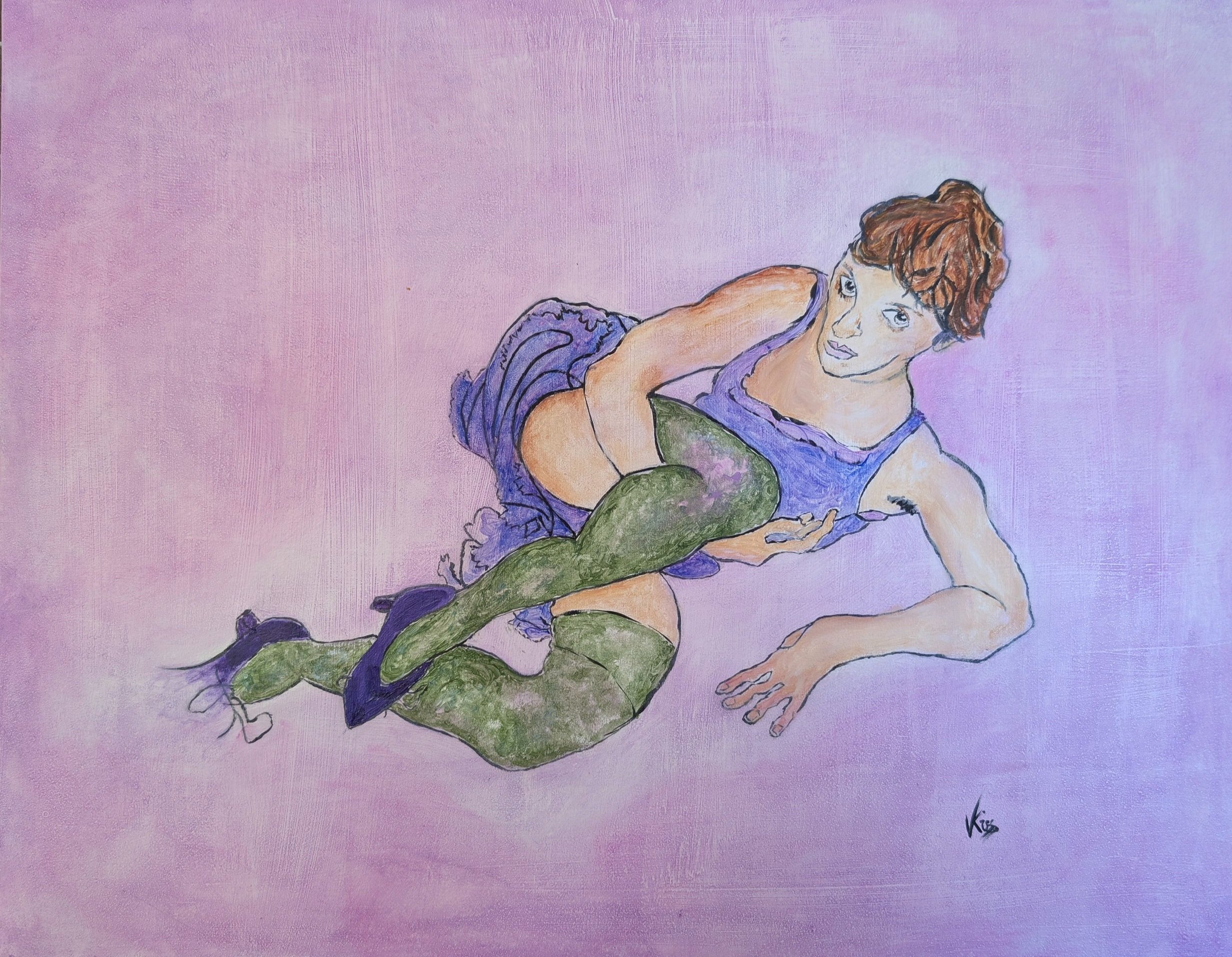
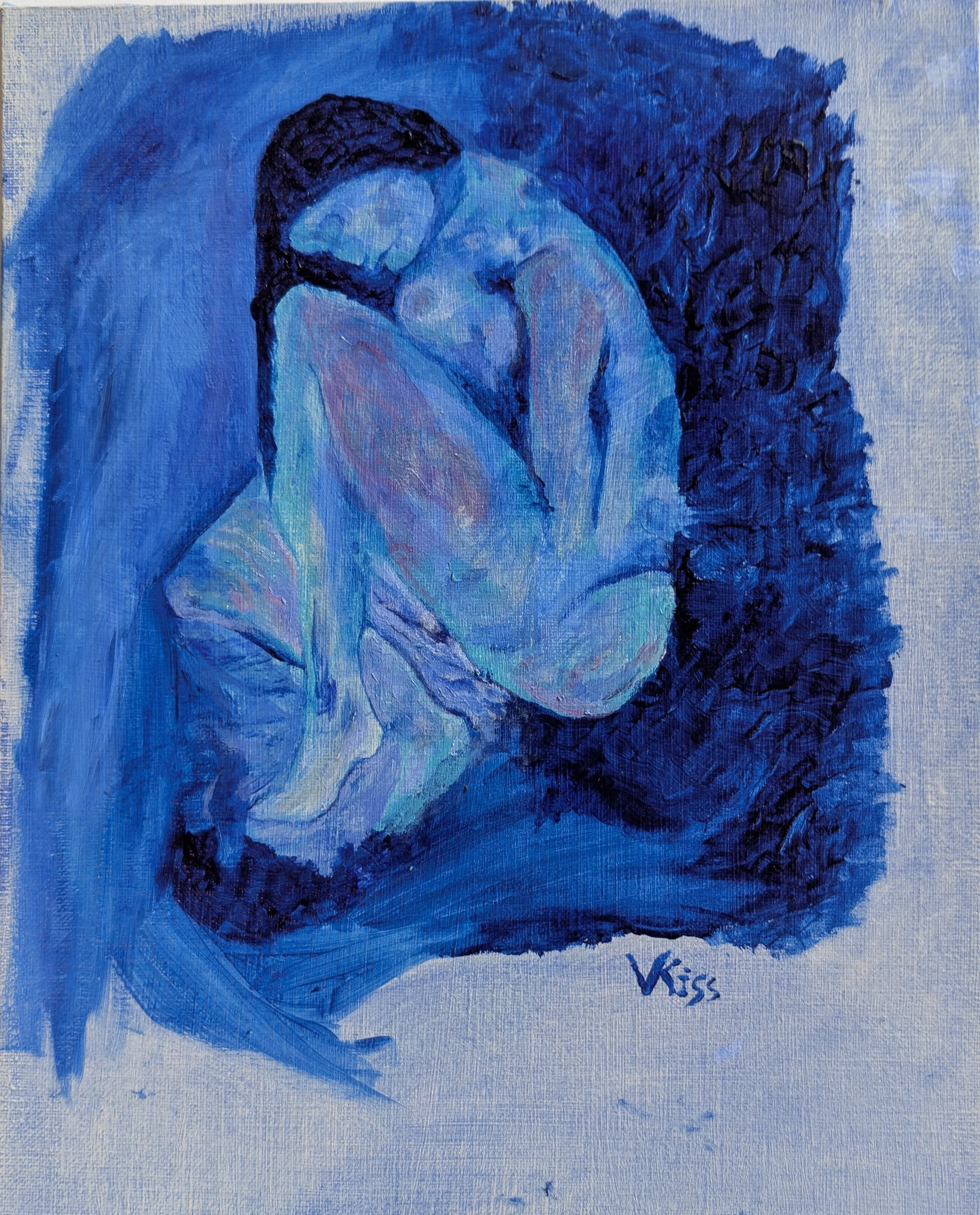
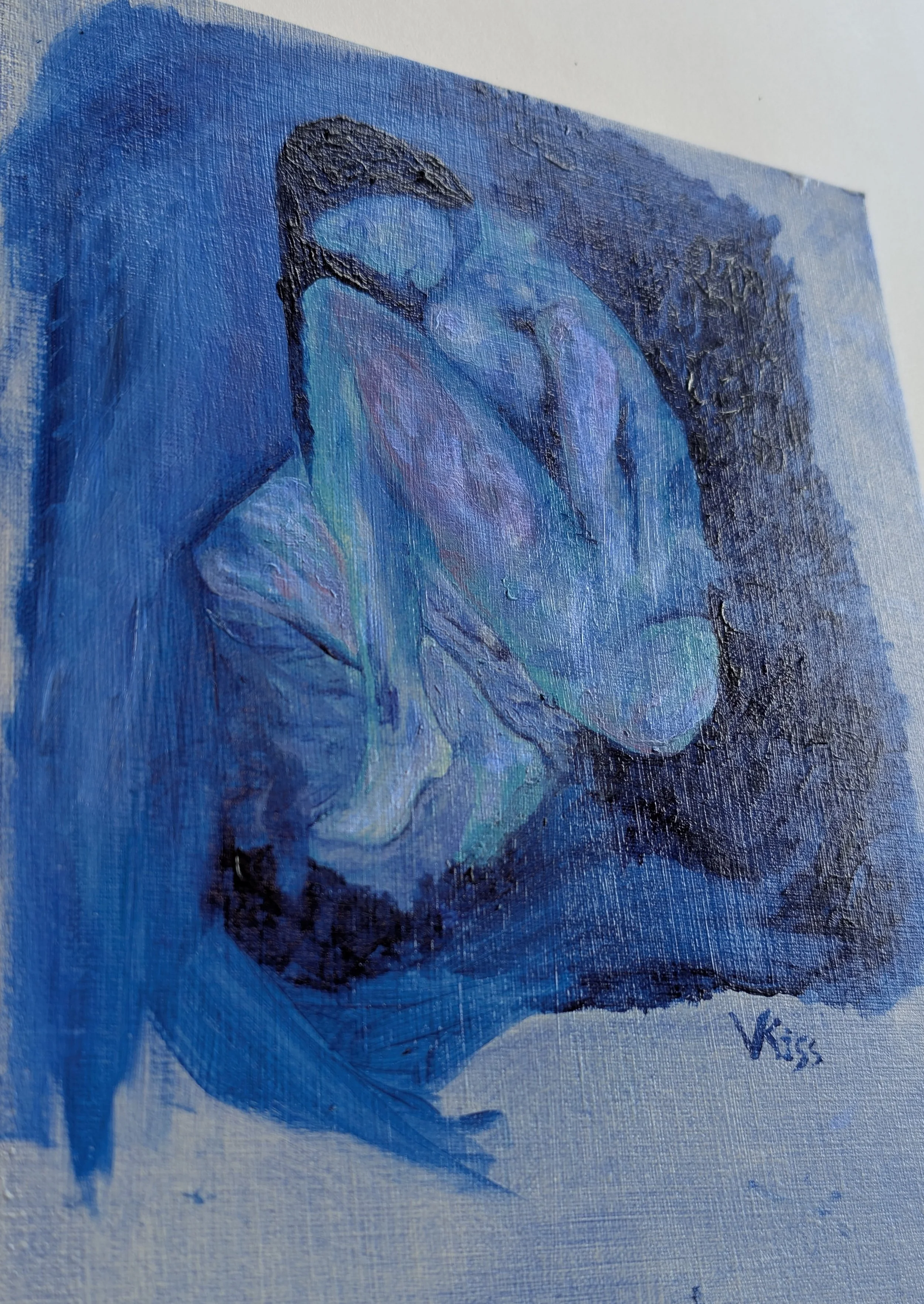
Luna Viola
Luna Viola
Luna Viola
Expressionist Egon Shiele inspired this reimagined work. How was he able to see the world in its simplest form, reducing its complexity without losing meaning and emotion? Sinuous lines arc provocatively yet preserve individual symmetry as they touch and interact to form a greater harmony. The observer builds upon the harmony as it enters into consciousness with a meaning that is as individual as it is a part of the whole.
The process
The smoothest possible surface was desired to support the thin painted outlines. Two coats of titanium white paint applied in cross sections formed the foundation on a 14 x 17 inch Gessobord. Lightly sanding with 400 and 1000 grit sandpaper further smoothed the surface. A cut out copy of the drawing outline was traced with pencil. This provided the bounding dimension making it easier to draw detail to proportion.
Flat black Matte acrylic paint was applied using a #0 Mightlon round brush. Initially the tracing of the pencil lines proved to be very problematic. After some practice I learned to keep the brush quite vertical but at enough angle so I could gauge the distance from brush tip to board. Next was understanding the dynamics of brush paint loading in relation to speed of application. From time to time the brush needed to be wetted and dipped more frequently in matte medium as the paint began to dry. As in drawing, erasing is essential. White paint acted as the eraser cleaning up the numerous blotches and misguided lines.
Having completed the most difficult part, it was liberating to freely paint between the lines and not care about consistency or even whether the paint meets the line!
Initial Drawing from Shiele’s painting

Picasso Blue
Beneath Pablo Picasso's "A Blind Man's Meal" lies a somber image of a woman curled in a fetal position. Known as his Blue Period, Picasso's works from this era depict the grim aspects of human existence, including poverty, solitude, addiction, and aging.
Hidden Picasso Blue
Iridescent View
Hidden beneath Pablo Picasso's "A Blind Man's Meal" lies a sombre image of a woman curled in a fetal position. Known as his Blue Period, Picasso's works from this era depict the grim aspects of human existence, including poverty, solitude, addiction, and aging. Although these paintings are highly valued today, Picasso's popularity declined at the time because people did not want to hang such artworks in their living rooms. It is believed that, due to his limited resources, Picasso economized on canvas by painting over earlier works.
X-ray fluorescence (XRF) imaging extracted the underpainting and AI trained in Picasso’s painting style then generated an image of what might have been. The iridescent eye candy rendered by the AI immediately beguiled me. Not consciously aware of my surrender to the algorithm biases designed to capture humans I began to perceive the emotion conjured by Picasso.
For more detail, please see the article below:
This incredible Picasso nude has been hidden from history until now
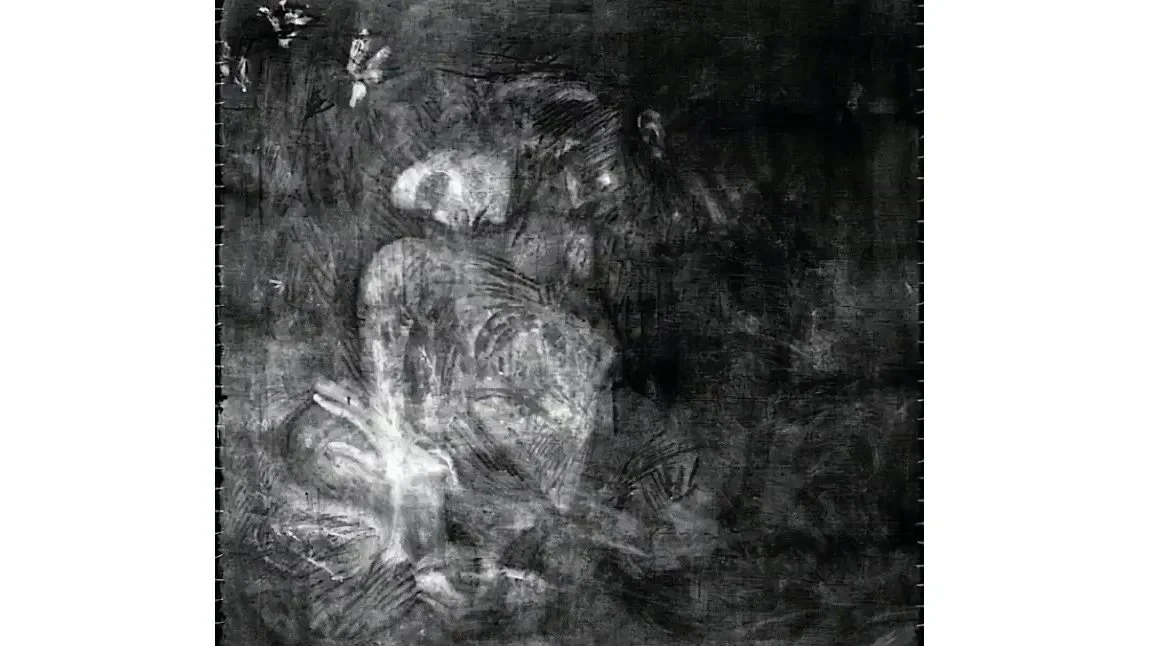
XRF Image from “A Blind Man’s Meal”
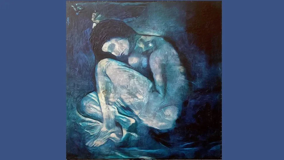
“Picasso Trained” AI Image from XRF above
Without a Care
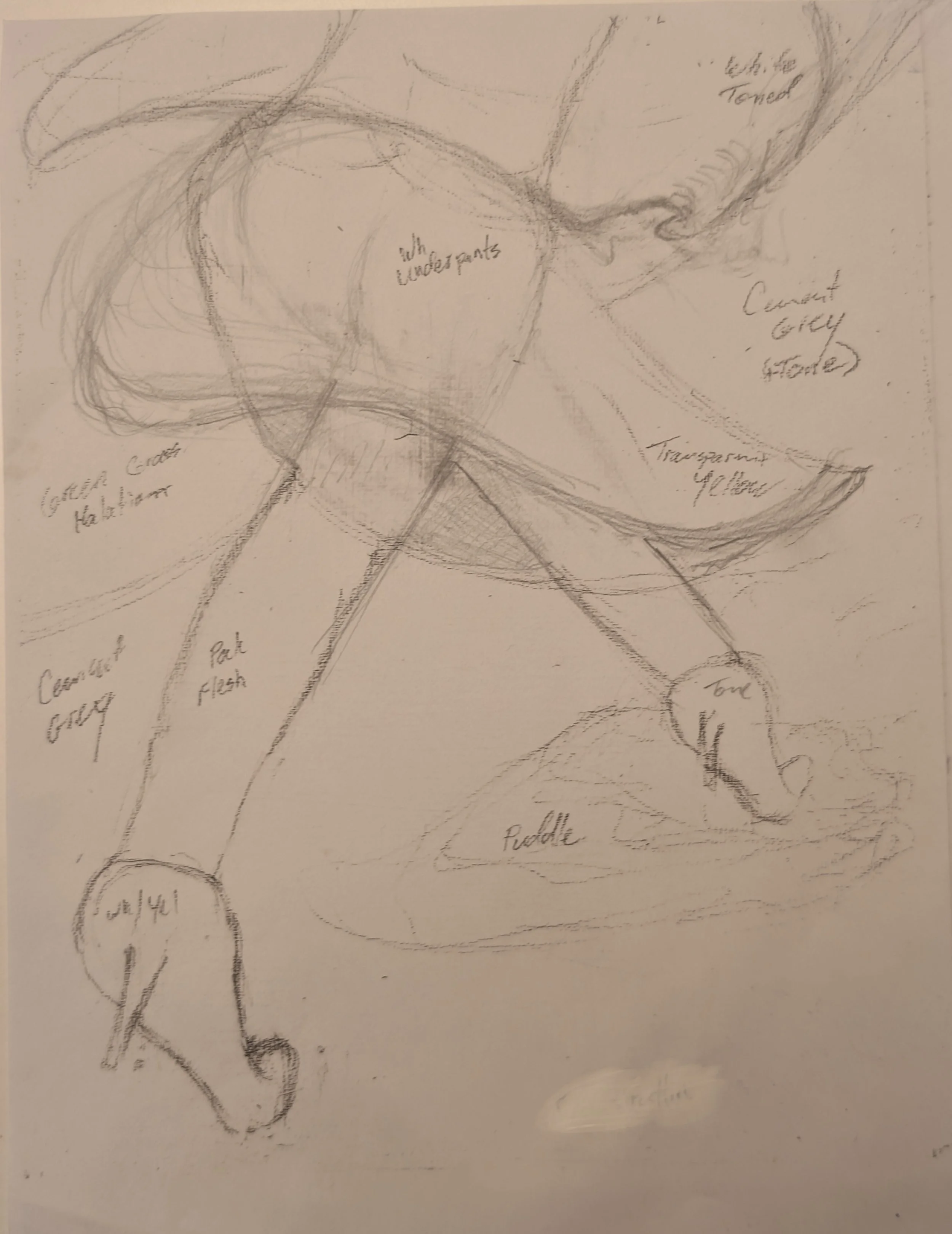
A young woman in heels seems to defy gravity as she hurries along the wet pavement. In the prime of her life, she moves with confident pace and balance as she propels herself forward. A puddle is normally something to be avoided, her attention may be elsewhere; perhaps she is lost in thought or so full of joy that she simply doesn’t care.
“Without a care” head on
“Without a care” at an angle
Final sketch
Knowing when to care is an ongoing lesson for this artist as misplaced caring sips time and energy potential. Mastery liberates the mind from the mechanical process of doing leaving more space and time to focus on greater things - or nothing at all.
In this study a young woman in heels seems to defy gravity as she hurries along the wet pavement. In the prime of her life, she moves with confident pace and balance as she propels herself forward. A puddle is normally something to be avoided, her attention may be elsewhere; perhaps she is lost in thought or so full of joy that she simply doesn’t care.
Notes:
Focus on high heel shoe - perspective of shoes
Drawing of a leg inspired Motion - youthful, airy, fun
Skirt- convey motion, complement form of girl. Add Texture, billowing
Blouse - Fluffy like wings
Puddle - disturbance, splash, glitter
Shadow - realism, emphasize motion
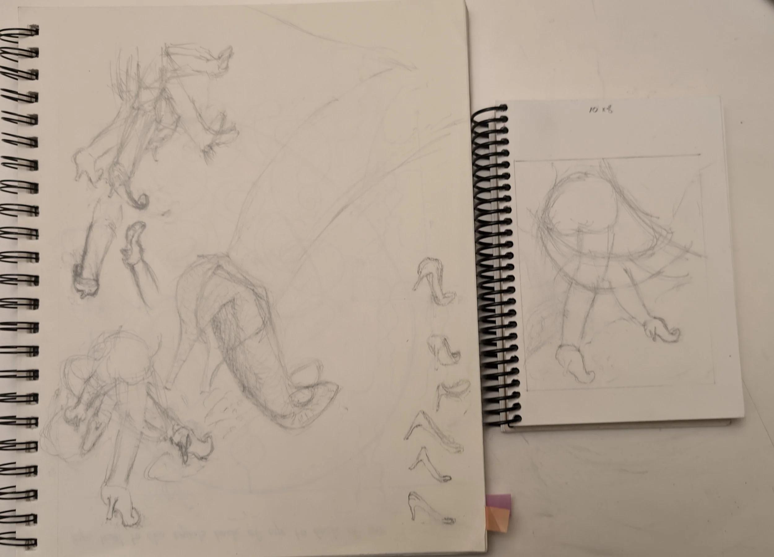
Concept sketches
Graphite was mixed with Carbon Black to produce a sheen for the sidewalk. The puddle of Aqua Marine and Phthalo Blue was skirted with Mars Black and sprinkled with Graphite. After drying scraping areas of the textured puddle left a glitter effect that varies with the angle of lighting.
Hurrying to add a last minute shadow really messed things up causing rework and delay. It could use more touching up - there is always more that can be done. Or, leave space for other things.
Matte Medium + Graphite
Into the “Night Music”
Proceed with caution…
Into the Night Music
What reality does a dreamscape conjure? Whether or not time exists with a past and present, we may agree to weave a series of moments for this story. To be sure, Dorothea Tanning's Eine Kleine Nachtmusik is central to the tale.
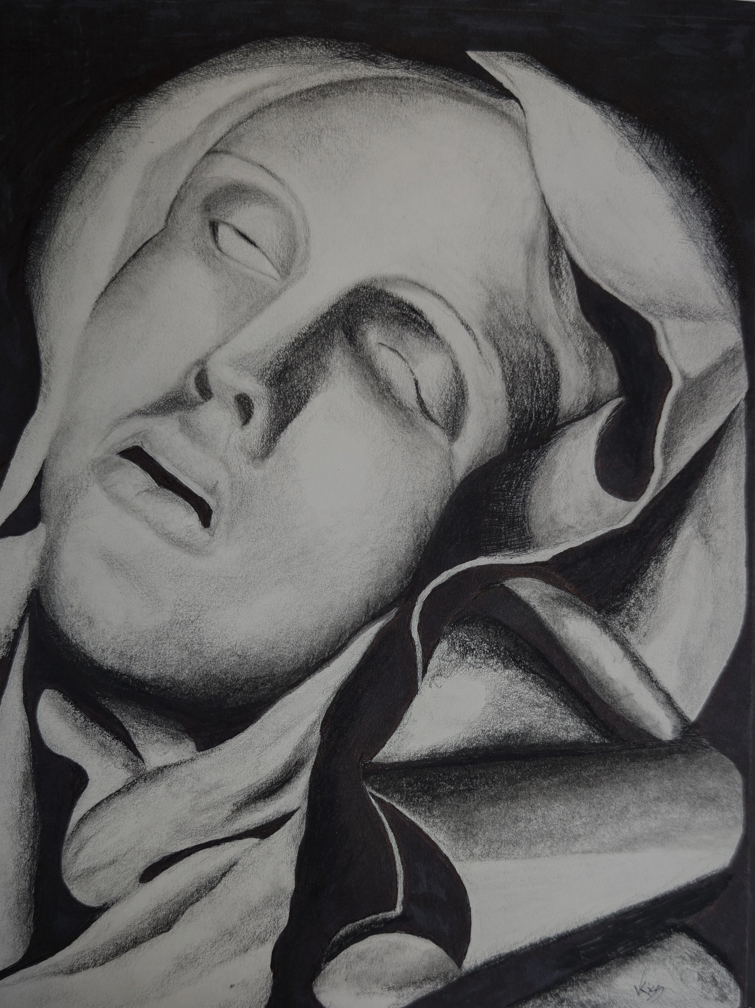
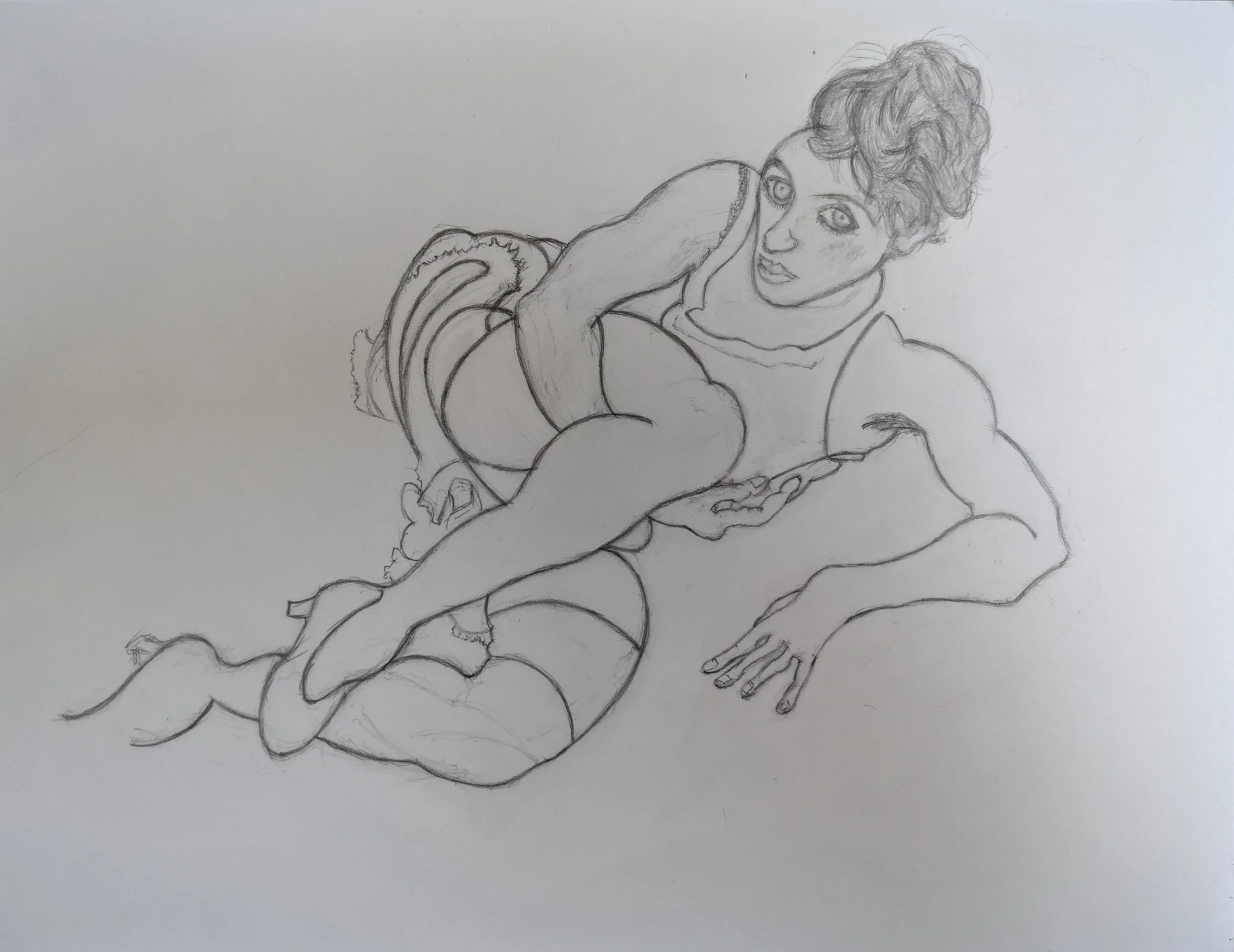
Avila
Drawing of Tamara de Lempicka’s “Sainte Thérèse d’Avila” painting
Tamara de Lempicka’s “Sainte Thérèse d’Avila” reimagines Gian Lorenzo Bernini’s sculpture. With pencil and black ink I pushed her art deco style toward my version of realism. It came together easily giving me a deep appreciation for her framework in realism supporting her style.
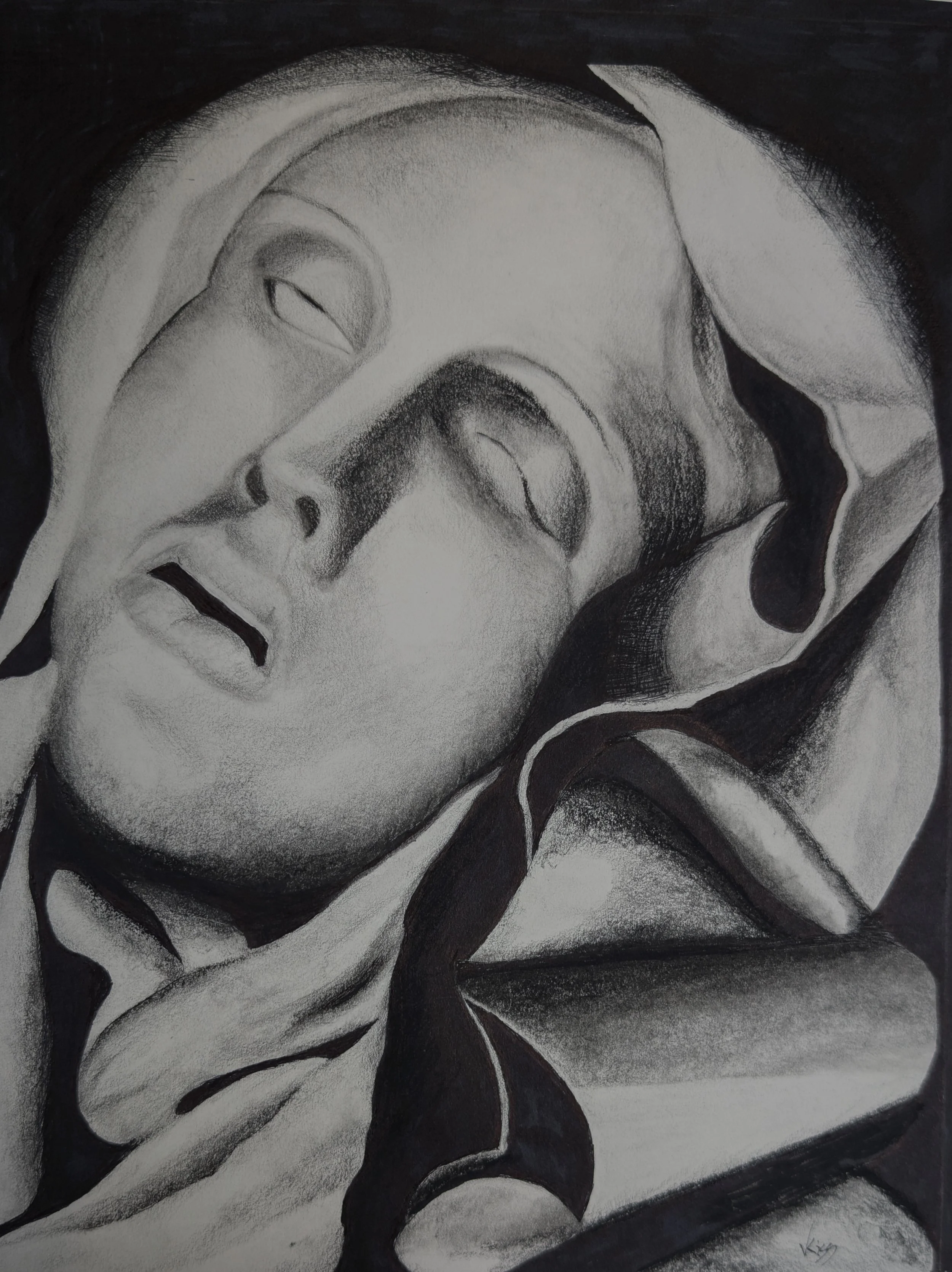
Drawing of Ecstasy of Saint Teresa
Disappointed with the photo reproduction of my drawing of “Modesty”, I was eager to try again on this project. But this time I would work from a painting of a statue! Experimenting with ink markers, charcoal, carbon and graphite pencils I was determined to enhance the contrast of this drawing. Hashing and even dotting with ink further enhanced degrees of shading values.